arrowbascket-darkbascketbasket-darkbasketcarousel-next-cornercarousel-nextcarousel-prev-cornercarousel-prevdrop-whitefbhi_resmailmodal-closemovenext_whitepenphotoprev_whitevkok
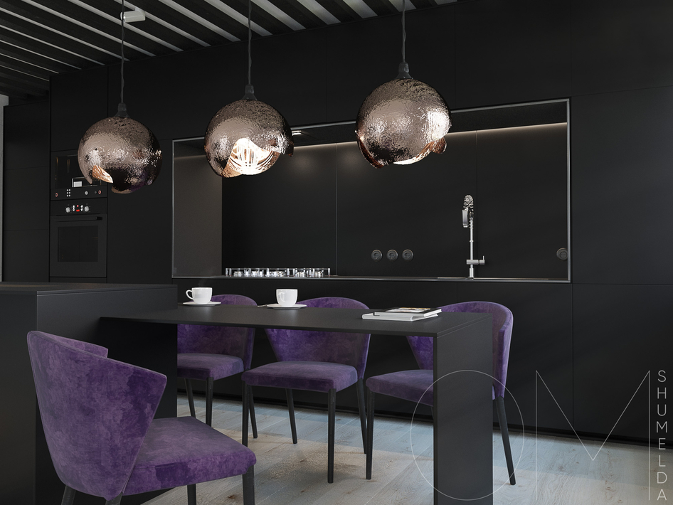
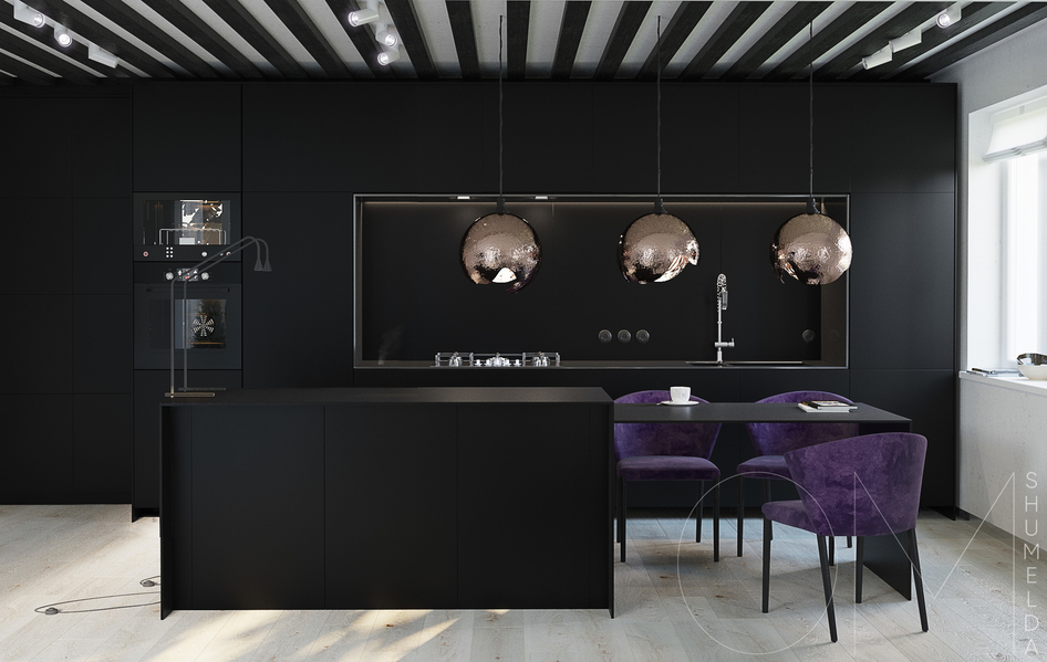
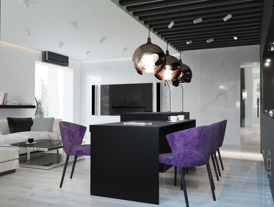
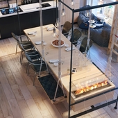
We have chosen summer mood and blueberry colour to clarify this bright interior. And there is no secret that you eat with your eyes and we use this fruity colour to catch attention of the inhabitants of the house and their visitors to this interior and its details.

Другие работы kredens456

Комментарии (11)

0
GodModeling
cheto shumno i shaderi ne ochen
0
MURAD_AKAEV
+5
0
sten
космос!
+2
violet21
YA UZHE VIZHU VSE OTPECHATKI NA KUHNE...
+1
3ton
5, но вопрос: что парует на столешнице на втором кадре?)
+1
kredens456
Так вышло просто))Учту))
0
Alara
Такой себе компромис между чёрным и белым)Мне очень нравится!Автору 5+
0
greshnovk
+5
0
jenia3341
сплитку врятли стоило выделять черным))) а в целом все очень стильно)))очень классные светильники!!)))
+2
kredens456
Светильники авторские, специально для даного интерьера)
0
hogarndex
Качественно и красиво, бомбяцкая работа! +5!