arrowbascket-darkbascketbasket-darkbasketcarousel-next-cornercarousel-nextcarousel-prev-cornercarousel-prevdrop-whitefbhi_resmailmodal-closemovenext_whitepenphotoprev_whitevkok
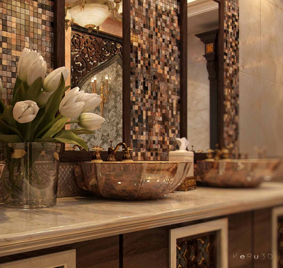
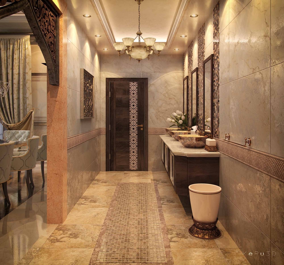
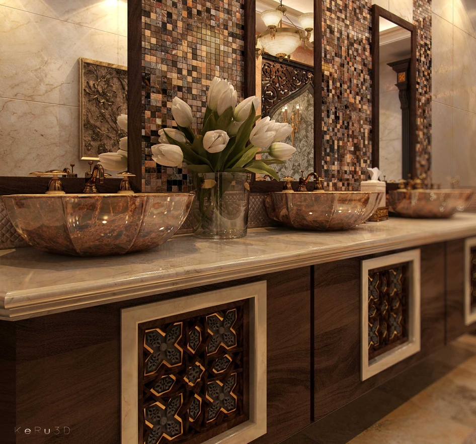
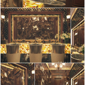
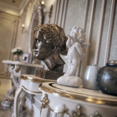
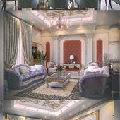
Hello Artist, I just want to share to you all the work that I have done in our last project. Done with 3dsmax, vray 2.4 and PS. comments and suggestion are very much welcome.. thank you and keep rock'n!

Другие работы lostinsight

Комментарии (23)

0
ital
Super!
0
tkozodaev
как красиво!
+1
Andrew Popov
I really like it, good light fulfilled!
+2
dgein
Наше представление о жизни арабских шейхов?
+1
naumov-studio
! unreal
+2
lostinsight
Thank you guys, I'm flattered that you like it and I should have posted the rest of the house views.
+1
2616
Неужели я тоже когда нибудь так смогу... МЕГА!!!! Мои аплодисменты!!!!
+8
Ales522
Не знаю. но хоть убейте не пойму что тут супер!!
+1
skifff
Шикарно. Правда плинтуса не хватает
+1
nguyenvandoan
AMEZING!
+2
sevostyanov
по визу сбавить интенсивность иесок в 2 - 2,5 раза, повысить освещенность камеры шаттер спид и выровнять баланс белого (последнее можно в фш автоколор+автотон) и будет вообще красота!

а так ощущение, что на стенах свет от светильников-точек ватт по 200, при этом люстра светит ватт на 10 и все желтит

з.ы. хотя может мне моник стоит поменять?
+1
ganibal
здорово!
+1
Красиво! Но не хватает каустики! А на ближних ракурсах она должна быть!
+1
Coockie
DOF is not good. Generally nice.
+1
ddekart
Very nice design !... & realistic render !.. Super !!!...
+1
simon310
Здорово!
+1
lostinsight
Thank you guys, I really appreciate your comments and suggestions. the next time I will make another one related with this, I am happy to put those suggestion that you have listed here. Thanks a lot artist!
0
ewwa111
I like only the first image, but here tulips unnatural, gray petals and bump on the material or change it, because it looks like a crumpled paper, glass vases and water unnatural. On the other images a lot of yellow light, IMHO it is necessary add blue light source for compensation.
0
Ales522
I do not like the texture of marble , light, tulips ! Everything here is wow wow . Well I for one vauuuuuuuuuuuuu
0
697011
Красивоо
0
Vuples
а чем отличается 1 и 3 ракурс
0
dagger-i
хороший такой китайский интерьер!
0
kotikmarsyuta
а мозаика такая текстурой и бампом или каждый чип отдельно и мультитекстура?