Ирис кис-кис
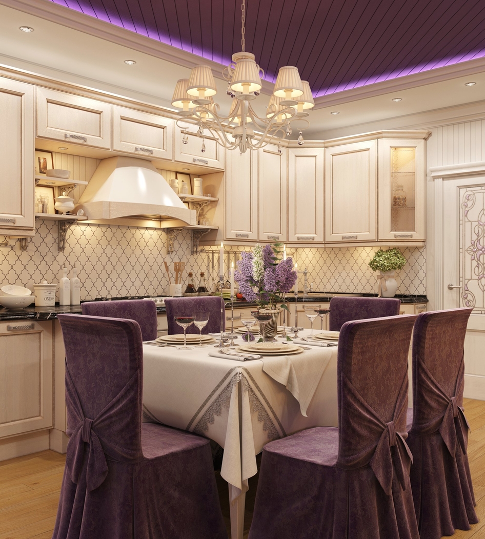
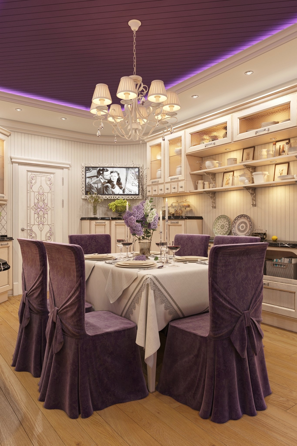
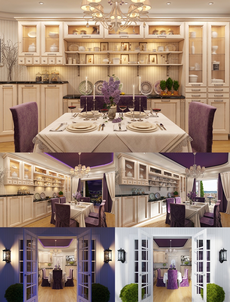
The interior of the kitchen is made in a classical style where the minimum of colors is used. Basic – white and cream, accent – lilac. The ceiling is made of environmentally friendly lining, painted in violet. The walls are also covered with a lining, only white.
The apron uses white ceramic tiles in the form of a classic stylized four-leaf clover, with a dark purple grout to most clearly show its shape. Also in the interior is used a color illumination – purple and orange, which creates a contrast between the backlight and the standard white light. Given these features, white and creamy gets pleasant, soft transitions between colors.
A special feature of this room is a great view from the window, so, on a balcony located recreation area, consisting of neat wrought coffee table and a couple of chairs. Thuja, planted on the balcony will create a pleasant aroma, and the shade will provide tight curtains both in the room and on the balcony.
Комментарии (10)
mrwal
dimarh11
flur
yaya007
mariajanete
solomon5555
javohir199307@mail.ru
MacVis
timur0686


