gergieva.marina@gmail.com
Full project:
www.studio-pine.com/minima-apartment
www.facebook.com/designstudiopine
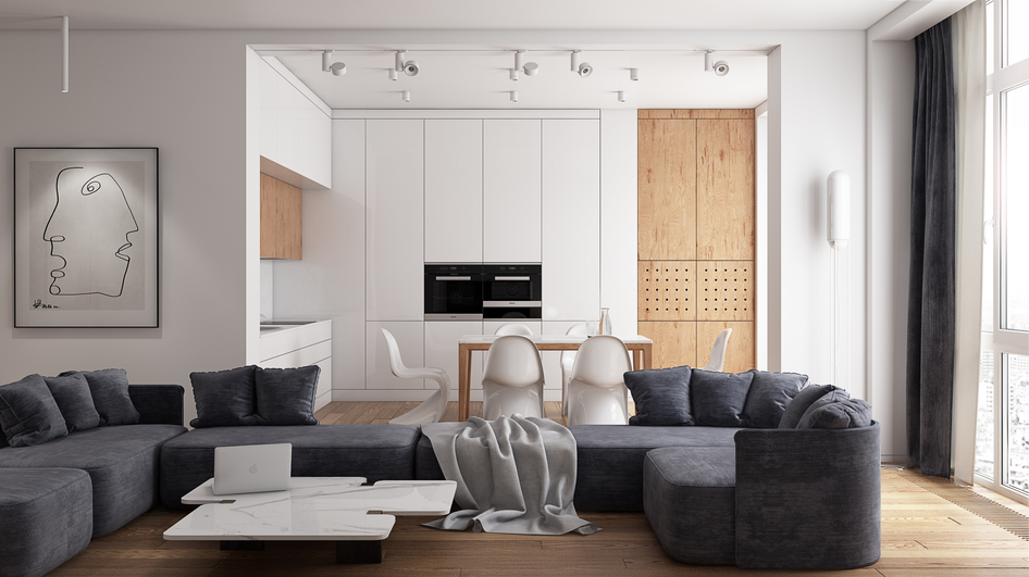
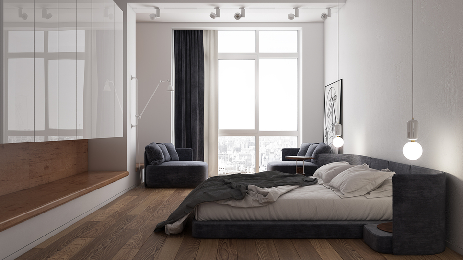
"When we created this project we wanted all details to be in balance with each other. White and glossy surfaces balances with the natural wooden ones, dark fabric of sofas and curtains balances with the surrounding colors and plays the role of the contrast elements. In this way we wanted to show that when the colors and surfaces are in harmony they turn into a beautiful background for the further filling. I mean that we created a background and the future pastime of our clients who will live there will complement the Interior. And it was the main reason and the main role in this apartment we worked with." StudioPine
Комментарии (8)
byurii94
paeonie
byurii94
Nervosa
Oleg_Vizer
uhartseva
nas777


