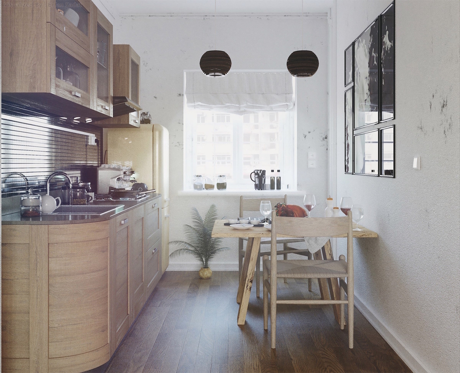
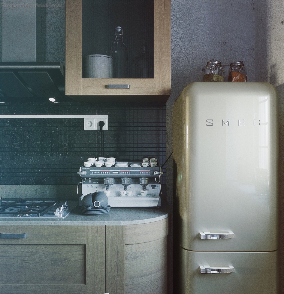
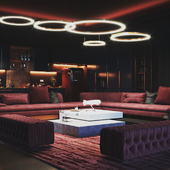
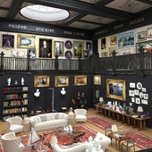
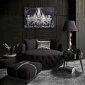
The coffee machine, as already mentioned, seriously to small! Look at the cups in it and the cups in front - that makes it even worse. The same goes for the plant in kitchen - the size of the pot looks funny.
That white thing for cables comming from socket looks really bad. Maybe it could at least be black as the tiles.
But i like everything elese - nice composition of "photos", lots of details, nice materials. 4/5
Sorry, but with the furniture you fail.
Why is there a round office near the refrigerator? That it was impossible to open (this is a very gross error)
A little less. The handles on the doors of the program fan set (where God sends)?
Try to put the sockets on the apron below (so that the wires do not telepal), although I may not be right about this code, I do not know
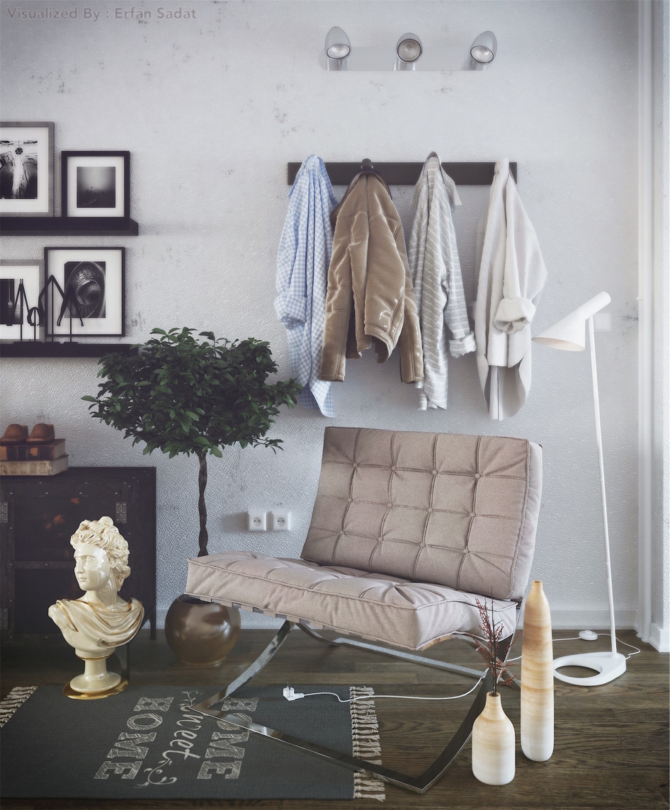
Why is the hanger on the first picture and even illuminated (antiquary at the exhibition?)