raybrig
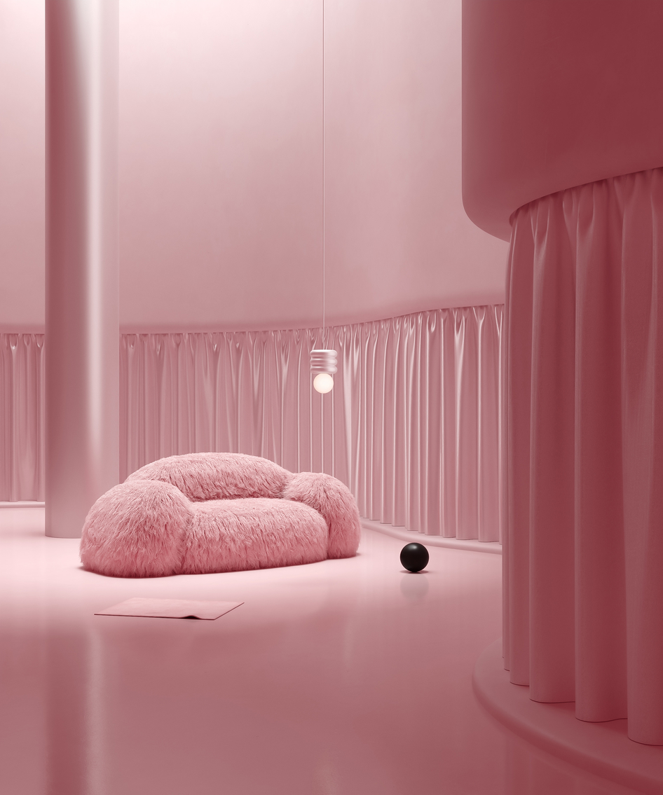
These series of digital spaces has been developed for presenting the furniture I created. Initially, I've created just a n armchair but decided to go further and create some more types of furniture in the same style. They are a bit clumsy, disproportional, big, shaggy and I did it on purpose because I think there is something in it. I had been thinking how to present it, in what kind of interior or maybe in the wild with greening at the background, but finally decided to focus only on shapes, lighting and composition not thinking about room logic which the furniture is in. I wanted to create an atmosphere where Yeti would feel at home, that's why after going through a lot of room color layouts I stopped at pink colors shades and highlight the furniture just by effects of light and shade. Have a nice viewing.
More pictures and animation you can see on Behance: https://www.behance.net/gallery/105353313/Yeti-Furniture
Direction by Sphere studio
Furniture design by Vladimir Naumov
Комментарии (28)
grol69
Vladimir0131
grol69
alex151286
Vladimir0131
alex151286
ewwa111
grol69
ygoryan
grol69
el_s_poley_create
АнастасияA
dilya_1
alex151286
basskzn
desigual
zamanov1
velurrr
velurrr
ATENAF
FR-DESIGN
Syfert
cgalex
Nikolai Antokonenko
nguyenvandoan
Nervosa
3dviz85
arman.kashkenov

